Visual Problem Solvers
Graphic designer interview questions are deceptively simple. On the surface, they seem to be about software skills: “Do you know Photoshop?” But deep down, they are probing your ability to solve complex communication problems visually. In a world saturated with content, hiring managers aren’t just looking for someone who can make things “look pretty.” They are hunting for strategic thinkers who understand how color psychology influences buying behavior, how typography hierarchy guides the eye, and how to translate a vague client brief into a compelling brand identity.
The industry is evolving rapidly with the integration of AI tools and the demand for motion-ready assets. Interviewers will ask: How do you defend your design choices when a client says “make the logo bigger”? Can you explain the difference between Kerning and Tracking to a non-designer? How do you manage your files to ensure a smooth handoff to developers or printers? Your answers must prove that you are a disciplined professional who marries creativity with technical precision.
This comprehensive guide helps you design the perfect interview strategy. We explore the art of the portfolio review, the technical nuances of print versus digital, and the emotional intelligence required to handle harsh critiques. Whether you are a junior designer fresh out of school or a senior art director looking for a new challenge, these strategies will help you craft a narrative as polished as your pixels.
Design Thinking & Process
Q: Walk me through your design process from brief to final delivery.
I follow the “Double Diamond” approach: Discover, Define, Develop, Deliver. I start with Discovery, asking questions to understand the client’s goals, audience, and competitors. I research visual trends in their industry.
Then I move to Ideation, sketching loose concepts (thumbnails) on paper before touching the computer. I select the strongest 3 concepts to digitize. I present these for feedback, iterate based on critique, and then refine the final choice. Finally, I Deliver the assets in all required formats (print, web, vector) with a style guide to ensure consistency.
Q: How do you handle creative block?
I view creative block as a signal that I need more input. You cannot output ideas if the tank is empty. I step away from the screen. I look at design books, visit a museum, or even just take a walk to reset my brain.
If I am on a tight deadline, I switch tasks. I might work on file organization or kerning for a different project. I also keep a “Swipe File” of inspiring designs (mood boards) that I can browse to jumpstart my thinking. Discipline often beats inspiration; I just start moving pixels until something clicks.
Q: How do you stay updated with design trends?
I am a voracious consumer of visual culture. I follow design leaders on Behance, Dribbble, and Instagram. I subscribe to blogs like Brand New (UnderConsideration) to analyze logo redesigns.
However, I am careful to distinguish between “Trendy” and “Timeless.” While I learn new techniques (like 3D typography or glassmorphism), I evaluate whether they serve the client’s brand. I want my work to look fresh today but still relevant in five years, avoiding trends that will date quickly.
Q: Explain the difference between UX and Graphic Design.
Graphic Design is about Communication and emotional connection; it focuses on typography, color, and layout to convey a message or brand feel. It is often static (posters, logos).
UX (User Experience) Design is about Functionality and the user’s journey; it focuses on usability, wireframing, and how a user interacts with a product. While I apply UX principles (like hierarchy and readability) in my graphic work, UX designers rely more on data and testing, whereas I rely more on visual principles and aesthetics.
Technical Mastery & Terminology
Q: What is the difference between Raster and Vector images?
Raster images (JPEG, PNG, PSD) are made of pixels. They are resolution-dependent; if you scale them up, they become blurry/pixelated. They are best for photographs.
Vector images (AI, EPS, SVG) are made of mathematical paths. They are resolution-independent; you can scale them to the size of a billboard without losing quality. They are essential for logos and type.
Q: Explain “Bleed” in print design.
Bleed is the area of the design that extends beyond the trim edge of the paper (usually 0.125 inches). Printers cannot print exactly to the edge of a sheet.
By extending the artwork into the bleed area, we ensure that when the paper is cut to size, there are no white hairline gaps at the edges. Failing to include bleed is a rookie mistake that can ruin a print run.
Q: What is the difference between Kerning, Tracking, and Leading?
Kerning is the adjustment of space between two specific characters (e.g., tucking an ‘A’ under a ‘V’). Tracking is the uniform spacing across a whole block of text.
Leading (pronounced “ledding”) is the vertical space between lines of text. Mastering these three is what separates professional typography from amateur word processing.
Q: When would you use RGB vs. CMYK?
RGB (Red, Green, Blue) is an additive color model used for Screens/Digital (web, video). It creates color with light.
CMYK (Cyan, Magenta, Yellow, Key/Black) is a subtractive color model used for Print. It creates color with ink. Designing in RGB for a print project will result in dull, muddy colors because the gamut of print is smaller than the screen.
Q: Explain your file management system.
I am obsessive about organization. I use a standardized folder structure: 01_Assets, 02_Working_Files, 03_Proofs, 04_Final_Deliverables.
I name files logically: “Client_Project_Asset_Version_Date” (e.g., Nike_AirMax_Poster_v3_2024-05-12). I archive old versions rather than overwriting them. This ensures that any team member can open my folder and find the correct file instantly.
Q: How do you use “Grid Systems” in your layout?
Grids provide structure and rhythm. Whether it’s a 12-column grid for a website or a modular grid for a book, it helps organize information.
It creates alignment and consistency. However, I also know when to break the grid intentionally to create tension or focus. The grid is a tool for order, not a cage.
Design Scenarios & Client Management
A client says, “I don’t like it,” but can’t explain why. What do you do?
I become a detective. I ask probing questions to decode their reaction. “Is it the color palette that feels off? Does the typography feel too modern?”
I pull up the original mood board we agreed on. “We aimed for ‘energetic and bold.’ Does this design feel too chaotic to you?” Often, “I don’t like it” means “It doesn’t match the picture in my head.” My job is to bridge that gap with vocabulary they understand.
The client asks you to “Make the logo bigger” and it ruins the design.
I acknowledge their goal (brand visibility) but defend the design principle (white space). “I hear that you want the brand to stand out. However, if we make the logo too large, it crowds the headline and actually makes the whole ad look cheaper/cluttered.”
I offer a compromise: “Instead of sizing it up, let’s add more white space around it to isolate it, which draws the eye more effectively.” I advocate for the effectiveness of the design, not just my aesthetic preference.
You notice a typo in a brochure after 10,000 copies have been printed.
My stomach drops, but I own it immediately. I inform my manager or the client straight away. I don’t try to hide it.
I assess the damage. Is it a critical error (phone number/date) or a minor grammatical one? If it’s critical, I help coordinate a reprint or a sticker fix (if budget allows). I then review my proofing process (e.g., requiring a second set of eyes or client sign-off) to ensure it never happens again.
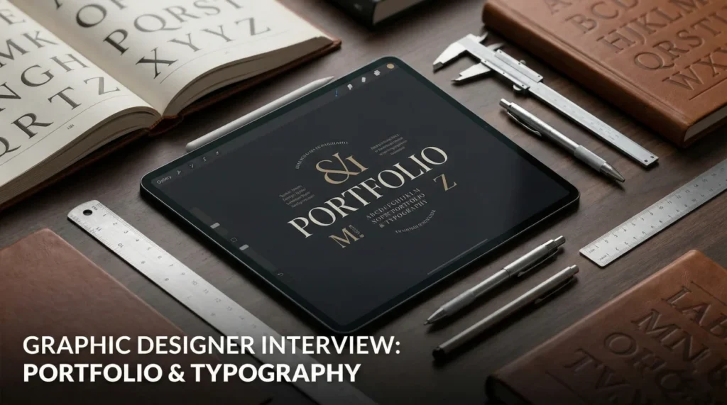
Portfolio Curation & Storytelling
Q: How did you choose the projects for your portfolio?
I chose projects that show range and process. I included a branding project to show systems thinking, a layout project to show typography skills, and a digital campaign to show versatility.
I prioritized quality over quantity. I removed older work that no longer represents my skill level. I also included one “passion project” because it shows my personal style and what I love to create when there are no client constraints.
Q: Walk me through this specific piece in your portfolio.
I structure my walkthrough using the STAR method (Situation, Task, Action, Result). “For this rebranding of a local coffee shop, the challenge was to attract a younger demographic (Situation).”
“I researched competitor logos and developed a custom hand-lettered wordmark (Action). The result was a 20% increase in foot traffic and a cohesive social media presence (Result).” I focus on the problem I solved, not just the colors I picked.
Q: Do you have experience with [Tool X that you don’t know]?
I am honest but adaptable. “I haven’t used Figma extensively yet, but I am an expert in Adobe XD and Sketch. The principles of UI design are transferable.”
“I am a quick learner; I taught myself After Effects in a weekend for a specific project last year. I am confident I can master your toolset within the first week.” I sell my ability to learn, rather than faking knowledge.
Q: Why do you want to work as a designer here?
I admire how your agency balances commercial goals with artistic integrity. I loved your recent campaign for [Client Name]; the use of typography was bold and unexpected. I want to work in an environment that challenges me to push my boundaries and where I can learn from senior creatives I respect. I believe my style of [Adjective] design aligns perfectly with your visual language.
Graphic Design Competency Quiz
Take the 20-Question Challenge
1. “Lorem Ipsum” is used as:
- The final copy
- Placeholder text to demonstrate layout without distracting content
- A font name
- A coding language
2. A “Vector” file format is:
- JPG
- EPS (or AI/SVG)
- PNG
- GIF
3. “Hierarchy” in design refers to:
- The boss of the agency
- Arranging elements to show their order of importance (eye flow)
- Using only capital letters
- The file size
4. The “Golden Ratio” is approximately:
- 1:2
- 1:1.618
- 3:4
- 10:10
5. “CMYK” is used for:
- Web design
- Print design (Process color)
- Screen projection
- Video editing
6. ” DPI” stands for:
- Design Per Inch
- Dots Per Inch (Resolution)
- Digital Pixel Interface
- Direct Print Image
7. A “Sans Serif” font lacks:
- Curves
- Small decorative lines/strokes at the ends of characters
- Capital letters
- Numbers
8. “White Space” (Negative Space) helps to:
- Waste paper
- Improve readability and focus attention on active elements
- Make the design look unfinished
- Save ink only
9. A “Brand Style Guide” typically includes:
- Employee salaries
- Logo usage rules, color palette, typography, and voice
- A list of competitors
- The CEO’s biography
10. “Opacity” determines:
- The color mode
- The transparency of an element (100% is solid, 0% is invisible)
- The file format
- The font size
11. “Leading” is the space between:
- Letters
- Lines of text (Baseline to baseline)
- Paragraphs
- Columns
12. A “Wireframe” is:
- A finished website
- A low-fidelity visual guide representing the skeletal framework of a webpage
- A type of 3D model
- A cable organizer
13. The standard resolution for Web images is:
- 300 PPI
- 72 PPI (though Retina displays use higher)
- 1000 PPI
- 10 PPI
14. “Pantone” (PMS) is a system for:
- Naming fonts
- Standardized color matching in printing
- Organizing layers
- Cloud storage
15. “Widows” and “Orphans” in typography are:
- Family members
- Single words left alone at the beginning or end of a paragraph/column
- Types of fonts
- Software errors
16. A “Mood Board” is used to:
- Test markers
- Establish the visual direction/feeling of a project before designing
- List tasks
- Present the final bill
17. “Contrast” is used to:
- Make everything look the same
- Create visual interest and distinguish elements (Light vs Dark, Big vs Small)
- Blend colors together
- Hide text
18. The “Rule of Thirds” helps with:
- Pricing
- Composition (Placing focal points off-center)
- Saving files
- Mixing paint
19. A “Glyph” is:
- A software bug
- An individual character symbol within a font set (e.g., @, $, &)
- A 3D image
- A color gradient
20. “Mockup” refers to:
- Making fun of a design
- A realistic representation of how the design will look in the real world (e.g., logo on a shirt)
- A rough sketch
- A rejected file
❓ FAQ
📜 Do I need a degree in Graphic Design?
Not strictly. While a BFA helps, your portfolio is King. If your portfolio demonstrates professional-level skills and thinking, many agencies will hire self-taught designers. However, a degree can fast-track you past the resume filters.
🖌️ Is it better to be a Generalist or a Specialist?
In the beginning, being a “T-shaped” designer is best: broad knowledge of many things (Generalist) with deep expertise in one thing (Specialist, e.g., Typography). Small agencies value generalists; large tech companies value specialists.
💻 Mac or PC?
Industry standard is overwhelmingly Mac. While Adobe Creative Cloud works on both, most design agencies run on the Apple ecosystem. Being proficient in macOS shortcuts is expected.
🧩 What is a “Design Challenge”?
It’s a test during the interview process. They might give you a prompt (e.g., “Design a landing page for a pet store”) and 24-48 hours. They are testing your process, speed, and how you interpret a brief, not just the final visual.
🤝 How do I handle a bad client?
Boundaries and Contracts. Always have a scope of work. Charge for extra revisions. Communicate clearly. Never take feedback personally; they are critiquing the work, not you as a human being.
Final Thoughts
To secure a position, your answers to graphic designer interview questions must show that you are a thoughtful creator, not just a tool operator. Agencies need designers who can articulate their “Why,” navigate client relationships with empathy, and deliver pixel-perfect work on deadline. By highlighting your design thinking process, your technical versatility, and your passion for visual problem-solving, you prove that you are the creative partner they need.
⚠️ Disclaimer: The interview strategies, sample answers, and negotiation tips provided in this guide are for educational purposes only. Hiring decisions are subjective and vary by company and industry. While these strategies are based on professional HR standards, they do not guarantee a specific job offer or result.