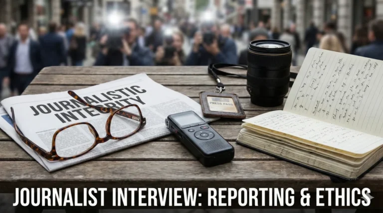
You Are Animating Decisions
Motion design is not about making things move. It is about choosing how they move so the viewer feels the right thing at the right time. That is why motion graphics designer interview questions often sound simple, but they are really probing your taste, your logic, and your ability to ship work that matches a brand.
Most teams are trying to avoid two problems: pretty animations that ignore the brief, and fast deliverables that look generic. Interviewers want to hear how you translate direction like “clean, premium, modern” into concrete choices: pacing, easing, spacing, type hierarchy, and transitions that feel intentional instead of accidental.
This guide helps you answer like a working motion designer. You will practice how to explain your workflow, your design thinking, and how you handle feedback, deadlines, and handoff requirements without losing craft.
Motion Design Fundamentals
Q: How do you define the difference between Motion Graphics and Animation?
I view Animation (specifically Character Animation) as “Performance.” It is about acting, emotion, and empathy, usually involving characters with narrative arcs. Motion Graphics is “Design in Motion.” It creates visual interest, communicates data, or reinforces branding using shapes, text, and logos.
While they share the 12 principles (like squash and stretch), Motion Graphics applies them to abstract objects. For example, I might use “Anticipation” on a text box before it slides in, but I’m not trying to make the text box feel “sad” or “happy” in the same way an animator would a character.
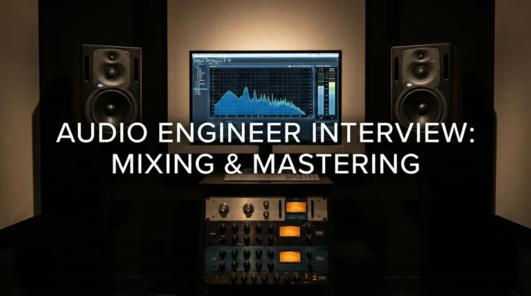
Q: Explain the importance of the Graph Editor (Speed/Value Graph).
The Graph Editor is the difference between “moving” and “moving well.” Default linear keyframes look robotic. I use the Graph Editor to manipulate the velocity curves.
For a premium feel, I often use a strong “Ease Out” (starting fast and slowing down gradually). For a high-energy promo, I might use steep curves for snappy, sudden movements. I rarely leave a keyframe untouched; customizing the curve is where the personality of the motion lives.
Q: What is “Kinetic Typography” and what are the rules?
Kinetic Typography is moving text that expresses an idea. The motion must reinforce the meaning of the word. If the word is “drop,” it should fall heavy and bounce.
The golden rule is Readability. If the motion is too chaotic, the message is lost. I ensure the text is on screen long enough to be read. I use motion to guide the viewer’s eye through the hierarchy of the sentence, often syncing tightly to the audio voiceover for impact.
Q: How do you approach “Brand Motion Guidelines”?
Just as a brand has a color palette, it needs a motion behavior. Does the brand move like a luxury car (smooth, slow, eased) or a sports drink (fast, glitchy, hard cuts)?
I analyze the static brand guidelines and extrapolate motion principles. I document these choices (e.g., “All transitions enter from the left with 70% influence”) so that any editor or animator working on the brand maintains consistency.
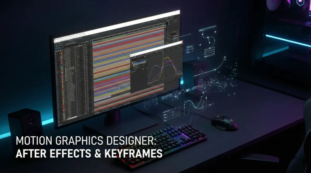
Technical After Effects Mastery
Q: What are “Shape Layers” and why are they powerful?
Shape Layers are vector-based graphics generated inside After Effects. They are infinitely scalable without pixelation.
They are powerful because they have built-in operators like “Trim Paths” (for drawing lines), “Repeaters” (for patterns), and “Wiggle Paths.” They are lightweight and render faster than imported footage.
Q: Explain “Parenting” and “Null Objects.”
Parenting links one layer’s transformation to another. If I move the Parent, the Child follows.
A Null Object is an invisible layer used as a controller. I often parent multiple layers to a single Null to control their global scale or position without messing up their individual keyframes. It keeps the timeline clean.
Q: How do you use “Track Mattes” (Alpha/Luma)?
Track Mattes use one layer to define the transparency of another. An Alpha Matte uses the shape of the layer above to show/hide content.
I use this constantly for text reveals (e.g., text rising up from behind an invisible line) or to confine a texture inside a logo shape.
Q: What are “Expressions” and give an example of one you use.
Expressions are snippets of JavaScript code that automate properties. Instead of manually keyframing a shake, I type `wiggle(5, 20)`.
I also use `loopOut(“cycle”)` to loop an animation indefinitely. Expressions save hours of manual labor and allow for procedural animation that is easy to update.
Q: Explain the “Essential Graphics” panel workflow.
This allows me to create templates (MOGRTs) in After Effects for video editors to use in Premiere Pro.
I expose specific properties (like text source, color controls, or logo choice) so the editor can customize the graphic without opening AE. It streamlines the workflow for recurring content like YouTube series.
Q: How do you optimize render times for a heavy project?
I pre-render (proxy) heavy comps like dynamic noise or 3D layers. I turn off motion blur until the final render.
I keep my project clean by removing unused assets. I ensure my disk cache is on a fast SSD. If a specific effect is slowing it down, I might render that layer as a ProRes video and bring it back in.
Client Feedback & Problem Solving
A client wants to change the voiceover after you have already synced the animation.
This is a major ripple effect. I check if the new VO has the same timing. If it’s longer/shorter, I have to re-time the keyframes.
I use the “elastic” sections of my animation (where there is a hold or a loop) to absorb the time difference. If I used markers or expressions linked to audio, it helps. I communicate to the client that this change requires significant “re-timing labor,” not just a swap.
The creative director says the animation “lacks punch.”
I translate “punch” to “contrast” or “overshoot.” I might add an “Overshoot” expression (where the object goes past its destination and snaps back) to make the arrival feel heavier.
I might tighten the spacing to make the movement faster. I check if adding motion blur or a slight “camera shake” on impact adds the visceral energy they are looking for.
You need to deliver a 15-second ad in 3 different aspect ratios (16:9, 1:1, 9:16).
I build the project with this in mind. I keep the main action in the “Center Safe” zone. I use pre-comps for the main elements so I can duplicate them into different composition sizes.
I might use a script or manually adjust the layout for vertical, ensuring the text is legible and the hero product isn’t cropped. I treat each ratio as a separate design problem, not just a crop.
Tools & Industry Trends
Q: What is your experience with Cinema 4D (C4D)?
I use C4D Lite (included with AE) for basic 3D text and logos. For complex 3D, I use C4D with Redshift/Octane renderers.
I know how to use the Cineware plugin to integrate 3D assets into my AE timeline. Even if I’m not a full 3D artist, understanding 3D space, lighting, and camera movement is essential for modern motion design, especially for “2.5D” work.
Q: How do you use Lottie (Bodymovin) for UI animation?
Lottie allows me to export AE animations as JSON code for web/apps. I have to design with constraints: no heavy effects, no raster images, shapes converted to paths.
I keep the file size tiny. I test the JSON file in the Lottie previewer to ensure it plays back correctly. This skill is critical for product design roles where file size impacts app performance.
Q: How do you manage plugins and scripts?
I use industry-standard plugins like Trapcode Particular (for particles) or Element 3D. I use scripts like “Ease Copy” or “Motion 3” to speed up workflow.
However, I am careful about over-reliance. If I hand the file to another designer who doesn’t have the plugin, it breaks. I always “bake” or pre-render plugin-heavy layers if I know the file is going to a team without that software.
Q: Why do you want to be a Motion Graphics Designer?
I love the intersection of graphic design and filmmaking. Static design is beautiful, but motion gives it a voice and a timeline. I enjoy the puzzle of fitting a complex message into a 10-second window. I find satisfaction in the technical problem-solving of After Effects and the artistic joy of seeing a static logo come to life.
Motion Design Competency Quiz
Take the 20-Question Challenge
1. “Keyframe Interpolation” determines:
- The color of the layer
- How values change between two keyframes (Linear vs. Bezier)
- The file name
- The render time
2. “Easy Ease” (F9) typically creates:
- A constant speed
- A smooth acceleration and deceleration (Slow In/Slow Out)
- A jagged motion
- A stop motion effect
3. A “Pre-composition” (Pre-comp) allows you to:
- Delete layers
- Group layers together into a nested composition for organization or effect application
- Export faster
- Change the frame rate
4. “Alpha Matte” uses:
- The brightness of a layer
- The transparency/pixels of a layer to define visibility
- The color blue
- Sound waves
5. “Motion Blur” simulates:
- Bad eyesight
- The natural streaking of fast-moving objects due to shutter speed
- Slow motion
- Focus problems
6. “Parallax” is achieved by:
- Moving everything at the same speed
- Moving background layers slower than foreground layers
- Using 3D glasses
- Changing colors
7. The “Anchor Point” is:
- A heavy weight
- The point around which transformations (rotation, scale) occur
- The center of the screen always
- The end of the animation
8. “Kerning” in kinetic typography adjusts:
- Line height
- The space between two specific characters
- The color of text
- The speed of text
9. A “Shape Layer” is best for:
- Photorealistic video
- Vector graphics that need to be scalable and modified (stroke/fill) within AE
- Audio editing
- 3D modeling
10. “Roto Brush” is a tool for:
- Cleaning the screen
- Isolating a subject from the background (Rotoscoping) automatically
- Painting textures
- Brushing hair
11. “Puppet Pin” tool allows you to:
- Make puppets
- Deform and animate raster images by placing control points
- Pin layers together
- Add sound
12. “Pick Whip” is used to:
- Delete layers
- Visually link properties or layers (Parenting)
- Speed up rendering
- Select colors
13. “Adjustment Layer” affects:
- Only the layer above it
- All layers stacked below it
- Nothing
- Audio only
14. “FPS” stands for:
- Files Per Second
- Frames Per Second
- Fast Processing System
- Final Project Size
15. “Continuously Rasterize” (the sun icon) ensures:
- The layer is blurry
- Vector layers remain sharp when scaled up
- The layer is hidden
- The sun is shining
16. “Trim Paths” is an operator used on:
- Video footage
- Shape layers to animate the start/end of a stroke (drawing lines)
- Audio tracks
- Text layers
17. “MOGRT” stands for:
- Motion Graphic Template
- Motion Graphics Template (for Premiere Pro)
- My Only Great Real Time
- Motion Original Graphic Text
18. “Overshoot” in animation means:
- Missing the deadline
- Going past the final value slightly before settling back (adds bounce)
- Shooting too much footage
- Rendering too high quality
19. “Posterize Time” effect allows you to:
- Make a poster
- Change the frame rate of a layer (e.g., make it look like 12fps stop motion)
- Stop time
- Speed up render
20. “Null Object” renders as:
- A red square
- Invisible (it is only a controller)
- Black
- White
❓ FAQ
🎞️ What does a hiring manager actually want to see in a reel?
They want clarity fast. Open with your strongest 10 to 15 seconds, show a few different styles that match the role, and make your contribution obvious. If it was a team project, label what you handled so nobody has to guess.
🧠 How do I explain my design thinking without sounding like a lecture?
Use one simple pattern: goal, choice, result. For example, “The product needed to feel trustworthy, so I used slower easing, cleaner spacing, and fewer elements on screen, which made the CTA easier to notice.” Short, specific explanations beat theory every time.
🧩 What is the best way to answer “make it pop” feedback?
Translate the note into variables you can change: contrast, timing, scale, and emphasis. Offer two options, one subtle and one bold, then let the stakeholder choose. You look senior when you turn vague feedback into controlled choices.
📦 How should I talk about handoff to editors or developers?
Show you plan for it early. Mention clean naming, organized precomps, and exporting in the right formats. If the work goes to web or app, explain that you avoid effects that do not translate well and you test exports so performance stays smooth.
⚙️ What if I am strong in 2D but weaker in 3D?
Own your strength, then show growth. Many roles value 2D fundamentals more than flashy 3D. Explain that you can art direct 3D, collaborate with specialists, and you are actively learning enough to integrate 3D elements without slowing the pipeline.
Final Thoughts
When you answer motion graphics designer interview questions, aim to sound reliable and intentional. Studios and brands hire the person who can take a brief, choose a motion language that fits, and deliver clean files that others can build on.
If you describe your workflow clearly, show restraint when it improves readability, and demonstrate that you can turn messy feedback into a better cut, you will come across as the designer who makes motion feel like part of the brand, not a random effect on top of it.
⚠️ Disclaimer: The interview strategies, sample answers, and negotiation tips provided in this guide are for educational purposes only. Hiring decisions are subjective and vary by company and industry. While these strategies are based on professional HR standards, they do not guarantee a specific job offer or result.