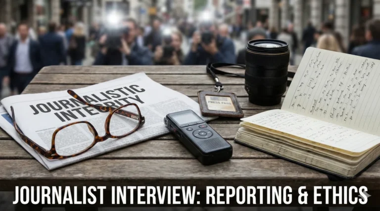
Your First 15 Minutes on the Job
A folder hits your desk with 10,000 RAW files, three naming conventions, and a client note that simply says, “Make it feel premium.” That is the real test behind photo editor interview questions. Hiring managers are not only asking whether you can retouch. They are asking whether you can build order out of chaos without breaking the look of the brand.
The best photo editors think in systems. You set a clean baseline, lock consistency, and then decide where detail work actually matters. You keep skin real while removing distractions. You match product color to reality without creating a file that looks perfect on your screen and wrong everywhere else.
This guide helps you speak like a working professional, not a tutorial. You will see how to explain frequency separation with restraint, how you protect color accuracy across devices, and how you respond when a request crosses an ethical line or violates a client’s standards.
Philosophy of Retouching & Ethics
Q: What is the difference between “Retouching” and “Editing”?
I view “Editing” (or culling/processing) as the broad strokes: selecting the best shots, adjusting exposure, white balance, and cropping. It is about getting the image to a correct baseline.
“Retouching” is the fine detail work: removing distractions, smoothing skin, reshaping objects (liquify), and localized color grading. Editing happens in Lightroom/Capture One; Retouching happens in Photoshop. I am proficient in both, but I know when to stop editing and start retouching to maximize efficiency.
Q: How do you approach skin retouching to ensure it looks natural?
I strictly avoid the “plastic” look caused by Gaussian Blur. My philosophy is “texture is truth.” I use Frequency Separation to separate the texture (high frequency) from the color/tone (low frequency).
This allows me to smooth out blotchy skin tones on the low layer without destroying the pores on the high layer. I also use Dodge and Burn to contour the face non-destructively. My goal is for the viewer to not know the image was retouched at all.
Q: How do you handle ethical dilemmas, such as body reshaping?
I adhere to the brand’s guidelines and industry standards. If I am working for a journalism outlet, I know that any structural manipulation is strictly forbidden. For fashion/commercial work, I follow the client’s brief but advocate for realism.
If a request feels excessive (e.g., making a waist anatomically impossible), I might offer a milder adjustment or discuss the potential backlash of “photoshop fails.” I believe in celebrating diversity and natural beauty whenever the commercial constraints allow.
Q: Explain “Non-Destructive Editing” and why it is critical.
Non-destructive editing means I can always go back to the original state. I never paint directly on the “Background” layer.
I use Adjustment Layers, Smart Objects, and Layer Masks. This increases file size but ensures flexibility. If a client wants to revert a specific change three days later, I can just hide that layer or adjust the mask opacity. Destructive editing paints you into a corner; non-destructive editing keeps the door open.
Technical Mastery & Photoshop
Q: Explain Frequency Separation.
It splits an image into two layers. The Low Frequency layer contains color and tone (blur). The High Frequency layer contains texture and detail (pores/hair).
This allows me to fix discoloration without blurring the skin texture, or remove a pimple without altering the shadow underneath. It is the industry standard for high-end beauty.
Q: What is “Dodge and Burn”?
It is lightening (Dodge) and darkening (Burn) specific areas to create depth and dimension. I use it to contour faces or fix micro-contrast issues.
I typically use a 50% Grey layer set to Overlay/Soft Light mode or Curves Adjustment layers with masks. It is painting with light, sculpting the subject to pop off the screen.
Q: How do you use “Smart Objects”?
Smart Objects preserve the source content. If I scale a layer down and then scale it back up, a raster layer loses quality; a Smart Object does not.
They also allow “Smart Filters,” meaning I can adjust a blur or sharpen filter anytime, rather than baking it into the pixels permanently.
Q: Explain “Clipping Masks.”
A Clipping Mask uses the content of one layer to mask the layers above it. It limits the visibility of the top layer to the shape of the bottom layer.
I use this constantly for product color changes. I make a precise selection of the product on the base layer, and clip all my Hue/Saturation adjustments to it so they don’t spill onto the background.
Q: What is the Pen Tool used for?
Precision selections (Paths). While AI selection tools are fast, the Pen Tool is accurate. I use it for cutting out products (silhouetting) with hard edges.
A clean path creates a vector mask that is infinitely scalable and crisp, essential for catalog work or composite images where edges must be perfect.
Q: How do you automate repetitive tasks?
I use “Actions.” I record steps for routine tasks like setting up frequency separation layers, resizing for web, or applying a specific watermark.
I then use “Batch Processing” or “Droplets” to apply these Actions to hundreds of images at once. Automation frees up my brain for the creative retouching work.
Client & Ethical Scenarios
A client says the product color in the photo doesn’t match the real item.
I ask for the physical product or a Pantone reference. Screens vary wildly (uncalibrated monitors), so “eye-balling” it on their phone is unreliable.
Once I have the reference, I use the “Info” panel in Photoshop to check the CMYK/RGB values numerically. I use Selective Color or Hue/Saturation layers to match it precisely. I explain to the client that while we can match the file, we cannot control the user’s screen calibration.
You receive a request to “fix everything” on a low-resolution JPEG.
I manage expectations immediately. “I can improve the color and contrast, but because this is a low-res file, I cannot add detail that isn’t there or print it large.”
I might use AI upscaling tools (like Topaz Gigapixel or Photoshop’s Super Zoom) to try and salvage it, but I am honest about the limitations. “Garbage in, garbage out” is the reality, but I frame it diplomatically as “resolution constraints.”
The Art Director wants a composite that looks physically impossible (lighting mismatch).
I try to solve it with “Global Grading.” I adjust the color temperature and contrast of the disparate elements to match as closely as possible.
If the shadows fall in opposite directions, I might flip an image or repaint the shadows manually. If it still looks fake, I advise: “The light sources conflict here. To make this believable, we might need to reshoot the background or choose a different asset.” My job is to protect the visual integrity of the brand.
Color Science & Grading
Q: What is the difference between Color Correction and Color Grading?
Correction is technical: fixing white balance, exposure, and skin tones to make the image look “normal” and consistent. It creates a neutral baseline.
Grading is creative: applying a specific mood or style (e.g., cinematic teal/orange, vintage sepia). I always correct first, then grade. If you grade an uncorrected image, the inconsistencies will be magnified.
Q: Explain “Color Profiles” (sRGB vs. Adobe RGB vs. ProPhoto).
These are color spaces (gamuts). sRGB is the smallest but the standard for Web/Mobile; I always export to sRGB for digital to avoid color shifting.
Adobe RGB is larger and good for print. ProPhoto RGB is the largest and best for archiving master files. I edit in the largest space possible (16-bit ProPhoto) and only convert to sRGB at the final export step (“Convert to Profile”).
Q: How do you calibrate your monitor?
I use a hardware calibration tool (like Datacolor Spyder or X-Rite). Software calibration alone is not enough for professional work.
I recalibrate every month or before a major project. I work in a room with controlled ambient lighting (neutral grey walls, no direct sunlight on the screen) to ensure my perception of color is accurate. If my screen lies, my work fails.
Q: Why do you want to be a Photo Editor?
I find peace in the details. I love the process of taking a raw, imperfect capture and polishing it into a jewel. I enjoy the blend of technical problem-solving (how do I remove this fence?) and artistic decision-making (how warm should this sunset be?). I take pride in being the invisible hand that makes the photographer’s vision a reality.
Photo Editing Competency Quiz
Take the 20-Question Challenge
1. “Frequency Separation” splits an image into:
- RGB and CMYK
- Texture (High) and Tone/Color (Low) layers
- Light and Dark layers
- Vector and Raster layers
2. A “Smart Object” allows for:
- Automatic editing
- Non-destructive scaling and filtering
- Smaller file sizes
- Deleting pixels
3. The “Clone Stamp” tool:
- Blurs the image
- Samples pixels from one area and paints them over another
- Erases the background
- Selects color
4. “Dodge” tool is used to:
- Darken pixels
- Lighten pixels
- Blur pixels
- Sharpen pixels
5. “CMYK” is required for:
- Web design
- Commercial Printing
- Video editing
- Phone screens
6. A “Histogram” displays:
- File history
- Tonal distribution (Shadows, Midtones, Highlights)
- Color names
- Layer count
7. “Masking” allows you to:
- Delete pixels permanently
- Hide or reveal parts of a layer non-destructively
- Add a filter
- Crop the image
8. “sRGB” is the standard color profile for:
- Magazines
- Web and Internet
- Billboards
- Fine Art Printing
9. The “Pen Tool” creates:
- Raster lines
- Vector paths and selections
- Brush strokes
- Text
10. “Liquify” filter is mostly used for:
- Making water effects
- Reshaping or distorting pixels (e.g., body contouring)
- Blurring backgrounds
- Color correction
11. “Metadata” contains:
- The image itself
- Information about the file (Copyright, Camera settings, GPS)
- The layers
- The history states
12. “Content-Aware Fill” uses:
- Magic
- Algorithms to fill a selection based on surrounding pixels
- The clone stamp
- A solid color
13. A “LUT” (Look Up Table) helps to:
- Find files
- Map one set of colors to another (Color Grading preset)
- Resize images
- Sharpen images
14. “White Balance” corrects:
- Brightness
- Color temperature cast (making whites look neutral)
- Contrast
- Resolution
15. “Resolution” for print is typically:
- 72 DPI
- 300 DPI (Dots Per Inch)
- 1000 DPI
- 10 DPI
16. “Blending Modes” (like Multiply/Screen) change:
- The layer order
- How a layer interacts visually with the layers below it
- The file format
- The opacity only
17. “Unsharp Mask” is used to:
- Blur the image
- Sharpen the image by increasing contrast at edges
- Remove a mask
- Add noise
18. “Chromatic Aberration” looks like:
- Black bars
- Purple or green fringing along high-contrast edges
- Grainy noise
- Lens flare
19. “Vignette” does what?
- Brightens the center
- Darkens the corners of the image to draw focus inward
- Adds a border
- Changes the aspect ratio
20. “RAW” file format allows for:
- Smaller file sizes
- Maximum data retention and editing flexibility (Digital Negative)
- Instant sharing
- No editing needed
❓ FAQ
🧾 What should I include in a portfolio for this role?
Show outcomes and process. Include before/after pairs, keep the edits believable, and label what you actually did. A short set of strong examples is better than a giant gallery with mixed quality.
🎛️ What is the fastest way to prove technical skill in an interview?
Talk about your workflow, not your favorite tools. Mention non-destructive layers, smart objects, masks, and how you keep files organized so revisions are painless. Managers hire editors who can deliver consistently, not only impress once.
🖊️ Tablet or mouse, what do studios expect?
A tablet is common for high-precision work like dodge and burn, hair, and delicate masking. If you can work with both, say so, but explain that you choose the tool that protects quality and speed for the task.
🧠 How do I answer questions about AI tools without sounding careless?
Position AI as assistance, not permission to cut corners. You still check edges, texture, and realism, and you follow brand rules on what can and cannot be altered. The safest answer is that you use tools to speed up repetitive steps while keeping human judgment on final output.
⏱️ How fast should I be, and how do I talk about speed?
Speed depends on the environment. E-commerce work is volume-driven, while high-end beauty and editorial can be slower per image. A strong answer explains how you protect turnaround time through presets, actions, batching, and a clean review process.
Final Thoughts
To stand out, your answers to photo editor interview questions should sound like someone who can ship reliable work every day. Taste matters, but consistency matters more. Studios want an editor who can match a look across thousands of files, keep skin and product details honest, and still hit deadlines.
Close with one story that proves judgment, not just technique: a brand look you protected, a color mismatch you solved cleanly, or a request you pushed back on because it would damage trust. That is the kind of professionalism hiring teams remember.
⚠️ Disclaimer: The interview strategies, sample answers, and negotiation tips provided in this guide are for educational purposes only. Hiring decisions are subjective and vary by company and industry. While these strategies are based on professional HR standards, they do not guarantee a specific job offer or result.