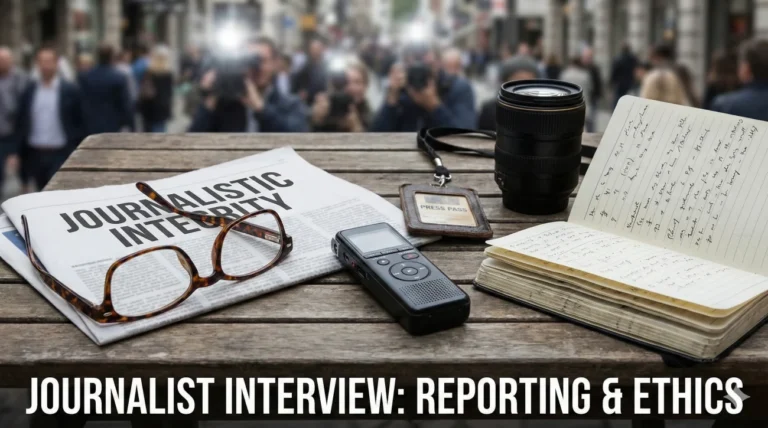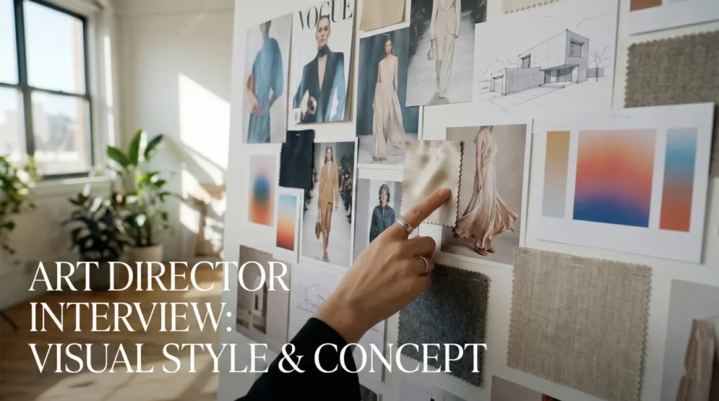
The Visual Translator
Art director interview questions search for a specific kind of dual-brain thinker. An Art Director (AD) lives at the intersection of strategy and execution. Unlike a Graphic Designer who focuses on the “doing,” or a Creative Director who focuses on the “why,” the Art Director focuses on the “how it looks and feels.” Hiring managers are looking for someone who can take a vague brief and translate it into a concrete visual language that a team of designers can execute flawlessly.
The role requires “Visual Fluency” across multiple mediums. It is not enough to be good at print; you must understand motion, UI, and social trends. Interviewers will ask: How do you give feedback that improves the work without demoralizing the designer? Can you explain the difference between a “concept” and a “style”? How do you maintain visual consistency across a 360-degree campaign? Your answers must prove that you have the impeccable taste to set the standard and the leadership skills to help your team reach it.
This comprehensive guide helps you frame your expertise. We explore the critical distinction between Art Direction and Creative Direction, the tactical art of the mood board, and the emotional intelligence required to manage creative egos. Whether you are stepping up from a Senior Designer role or moving laterally between agencies, these strategies will help you paint the perfect picture of your potential.
Role Definition & Philosophy
Q: What is the difference between an Art Director and a Creative Director?
I see the Creative Director (CD) as the strategic general and the Art Director (AD) as the tactical commander. The CD sets the high-level voice and business goals (“The Why”).
As an Art Director, I define the visual execution (“The How”). I decide the photography style, the typography hierarchy, and the color palette that brings the CD’s strategy to life. I am more hands-on with the design team, ensuring the pixels match the vision, while the CD handles the client relationship and broad agency direction.
Q: How do you define “Art Direction”?
Art Direction is visual storytelling. It is not just making things pretty; it is making things communicate. It is the deliberate choice of visual elements to evoke a specific feeling or action.
If design is the construction of the house, art direction is the architecture and interior design that gives it character. It creates the atmosphere in which the message lives. My job is to ensure every visual element, from the font choice to the lighting in a photo, serves the core concept.
Q: How do you stay visually inspired?
I curate my inputs religiously. I look outside of advertising for inspiration. I study cinema for lighting, architecture for structure, and fine art for composition.
I maintain a digital “Morgue File” (reference library) of images, textures, and type treatments that inspire me. I also encourage my team to share their inspirations weekly. Staying fresh means constantly feeding your eyes with high-quality visuals so you have a deep well to draw from when a brief lands.
Q: What is your approach to “Concepting”?
I start with words, not pictures. I brainstorm with a Copywriter to find the “hook” or the human truth. Once we have the idea, I start visualizing.
I sketch rough thumbnails (“scamps”) to test compositions quickly. I don’t jump into high-fidelity rendering until the concept is solid. A polished rendering of a bad idea is still a bad idea. I focus on the “Big Idea” first, then the aesthetic execution.
Visual Style & Concepting
Q: How do you create a Mood Board that is actually useful?
I don’t just collage pretty pictures. I organize the board by elements: “Lighting Reference,” “Typography Style,” “Color Palette,” and “Texture.”
I annotate the images to explain why they are there. “Note the rim lighting in this shot” vs “Ignore the model, look at the background.” A specific mood board aligns the team and client before we burn hours on design.
Q: How do you choose typography for a campaign?
Type has a voice. A serif font whispers tradition and authority; a geometric sans-serif shouts modernity and tech. I match the font’s personality to the brand attributes.
I also consider functionality. Is this for a billboard (readability at a distance) or a mobile app (legibility at small scale)? I pair fonts to create contrast and hierarchy, guiding the viewer’s eye through the message.
Q: How do you direct a photoshoot?
Preparation is 90% of the job. I create a detailed “Shot List” and “Shooting Board” so the photographer knows exactly what we need.
On set, I watch the monitor for details the photographer might miss – a wrinkled shirt, a weird shadow, or brand safety issues. I keep the energy up but focused. I ensure we get the “safe” shots first before experimenting with the “art” shots.
Q: How do you ensure visual consistency across different channels?
I create a “Visual System,” not just a key visual. I define the rules: “The logo always sits in the top left,” “We only use this specific filter on photos.”
I create flexible assets that can adapt. A horizontal banner needs a different layout than a vertical Story, but they must feel like siblings. I use a “Style Guide” to empower designers to execute independently while staying on brand.
Q: What makes a composition “dynamic”?
Tension and contrast. I avoid centering everything (unless it’s a very formal look). I use the Rule of Thirds and diagonals to create movement.
I play with scale – making one element surprisingly large creates drama. I guide the eye through the layout using lines and color weight. A dynamic composition feels alive and forces the viewer to look where I want them to look.
Q: How do you handle color theory in your work?
I use color psychologically. Blue for trust, orange for energy, black for luxury. I limit the palette to ensure impact.
I adhere to the 60-30-10 rule: 60% dominant color, 30% secondary, 10% accent. This prevents the “fruit salad” effect. I also check color contrast for accessibility (WCAG standards) to ensure the work is inclusive.
Leadership & Feedback
A designer presents work that is “off-brief” but visually stunning.
I validate the craft first. “This looks beautiful.” Then I pivot to the strategy. “However, the brief asks us to target soccer moms, and this feels very skater-punk.”
I ask them to explain their thinking. Maybe they saw a connection I missed. If not, I guide them back: “Let’s keep this energy but apply it to a visual language that resonates with our target audience.” I save the design for the portfolio but don’t show it to the client if it solves the wrong problem.
You need to give negative feedback to a sensitive creative.
I critique the work, not the person. I never say “You did this wrong.” I say, “This layout feels a bit crowded.”
I use the “Why” technique. “I feel this headline gets lost because the background is too busy. Let’s try simplifying the texture.” I make it a collaborative problem-solving session. “How do you think we can fix the legibility?” Giving them agency in the fix reduces defensiveness.
The client gives vague feedback like “Make it pop.”
I decode the feedback. “Make it pop” usually means contrast or hierarchy. I ask, “Do you want the headline to stand out more, or the image to be brighter?”
I translate it for my team. I don’t just tell the designer “Make it pop.” I tell them, “Bump the contrast on the hero image and increase the weight of the H1.” My job is to be the filter that turns vague client feelings into actionable design instructions.
Process & Client Relations
Q: How do you present creative work to a client?
I tell a story. I don’t just reveal the image. I start with the recap of the brief: “You asked us to solve X.” Then I explain the concept: “Our solution is based on the insight that…”
Then I show the work. I walk them through the decisions. “We chose this font because it conveys stability.” I anticipate their objections and address them proactively. I sell the thinking, not just the visual.
Q: How do you handle a tight deadline without sacrificing quality?
I simplify the execution, not the concept. If we don’t have time for a complex 3D render, we pivot to a bold typographic solution or a stylized 2D illustration.
I focus on the “Hero Assets” first. I ensure the Key Visual is perfect, and then we cascade that down to smaller assets. I prioritize. Perfectionism is the enemy of done. I push the team to get it “90% there” quickly so we have time to refine.
Q: How do you collaborate with Copywriters?
I view the Copywriter as my creative spouse. We brainstorm together from the start. I don’t want them to just “fill in the box” I drew.
Sometimes the visual leads, sometimes the headline leads. I love it when a writer has a visual idea or I have a headline idea. The best work comes when the line between art and copy blurs and they support each other seamlessly.
Q: Why do you want to be an Art Director?
I love the alchemy of combining images and words to create an emotion. I enjoy the puzzle of taking a strategic business problem and solving it with beauty and wit. I find satisfaction in guiding a team to produce work that is better than what any of us could do alone. I want to shape the visual culture, not just participate in it.
Art Direction Competency Quiz
Take the 20-Question Challenge
1. “Kerning” refers to:
- The space between lines
- The spacing between two specific characters
- The color of text
- The font size
2. A “Mood Board” is used to:
- Make the client happy
- Establish the visual direction and “vibe” before designing
- List the budget
- Schedule the shoot
3. “Hierarchy” in design ensures:
- The biggest element is always the logo
- The viewer’s eye is guided to the most important elements first
- Everything is the same size
- Colors are bright
4. “Bleed” is essential for:
- Digital banners
- Print designs that extend to the edge of the paper
- Websites
- Video editing
5. “CMYK” stands for:
- Color, Mode, Yellow, Key
- Cyan, Magenta, Yellow, Key (Black)
- Creative, Media, Yield, Kit
- Contrast, Mix, Yellow, K
6. A “Scamp” is:
- A rude designer
- A rough sketch of an idea used for internal discussion
- A finished file
- A type of font
7. “Leading” (pronounced ledding) controls:
- Letter spacing
- The vertical space between lines of text
- The width of the column
- The paragraph indent
8. The “Golden Ratio” is roughly:
- 1:2
- 1:1.618
- 3:4
- 10:10
9. “Brand Guidelines” are strictly for:
- Copywriters
- Ensuring visual consistency across all brand touchpoints
- The CEO
- Finance department
10. “DPI” stands for:
- Design Per Inch
- Dots Per Inch (Resolution)
- Digital Pixel Image
- Direct Print Interface
11. A “Serif” font is characterized by:
- Clean, straight edges
- Small decorative strokes/lines at the end of characters
- Being handwritten
- Being bold only
12. “White Space” (Negative Space) is used to:
- Waste money
- Reduce clutter and focus attention on the subject
- Make the file smaller
- Avoid printing
13. “Widows” in typography are:
- Lonely people
- A single word left alone on a line at the end of a paragraph
- Bold words
- Misspelled words
14. A “Comp” (Comprehensive) is:
- A computer
- A layout design presented to a client that closely resembles the final result
- A complaint
- A competition
15. “RGB” is used for:
- Print magazines
- Digital screens and web (Red, Green, Blue)
- Newspapers
- Painting walls
16. The “Rule of Thirds” involves:
- Dividing the team into three
- Placing focal points at the intersections of a 3×3 grid
- Using three colors
- Working three days a week
17. “Lorem Ipsum” is:
- Final copy
- Dummy text used to demonstrate layout without distracting meaning
- A font name
- A coding language
18. A “Vector” image (AI/EPS) is scalable because:
- It uses pixels
- It uses mathematical formulas (paths), so it never loses quality
- It is small
- It is black and white
19. “Contrast” helps to:
- Blend everything together
- Distinguish elements and create visual interest (Light vs Dark)
- Make text smaller
- Lower the file size
20. “Iconography” refers to:
- Famous people
- The style and system of icons used in a design
- Logo design only
- Religious art
❓ FAQ
📜 Do I need a design degree?
It is preferred but not mandatory. A BFA shows you have studied the fundamentals. However, a stunning portfolio and real-world experience (agency life) can trump a degree. Your book is your degree.
💼 Agency or In-House?
Agency gives you variety and speed, building a diverse portfolio quickly. In-House allows you to go deep into one brand and have more work-life balance. ADs often start in agencies to “earn their stripes.”
💻 What software must I know?
Adobe Creative Suite (Photoshop, Illustrator, InDesign) is the baseline. Proficiency in Figma/Sketch for digital work is increasingly required. Motion skills (After Effects) are a huge bonus.
🎨 How big should my portfolio be?
Quality over quantity. 6-10 stellar campaigns are enough. Show your role clearly (Concept vs. Execution) and include sketches to show your thinking process, not just final glossy images.
🤝 Do I need to be a good presenter?
Yes. Art Directors must sell their work. You need to be able to articulate “Why” you made a choice, not just “What” you made. Public speaking and storytelling are core skills for this role.
Final Thoughts
To secure a position, your answers to art director interview questions must show that you are a visionary who can execute. Agencies need leaders who can inspire a team to create award-winning work while keeping the client happy. By highlighting your visual storytelling skills, your ability to mentor designers, and your strategic approach to concepting, you prove that you are the creative force they need.
⚠️ Disclaimer: The interview strategies, sample answers, and negotiation tips provided in this guide are for educational purposes only. Hiring decisions are subjective and vary by company and industry. While these strategies are based on professional HR standards, they do not guarantee a specific job offer or result.