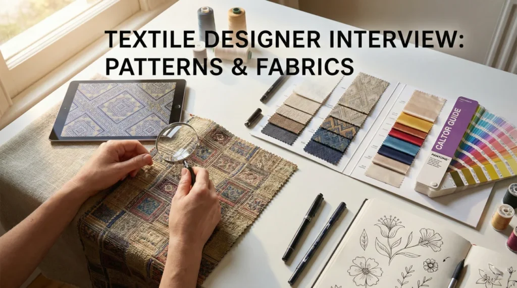
A Pattern Is a Product, Not a Painting
You can design the prettiest motif in the world and still fail the job if it cannot survive production. That is the quiet test behind textile designer interview questions.
Textile design sits in a tricky middle place: you have to think like an artist, then switch brains and think like a factory. Repeat logic, scale, color limitations, and fabric behavior all matter. A print that looks perfect on screen can look muddy on linen, too sharp on satin, or completely wrong after a dye lot shift.
In interviews, show that you do not just chase inspiration. You translate it into something buildable: clean repeats, practical colorways, and clear communication with mills and printers so approvals, strike-offs, and revisions do not turn into expensive surprises.
Design Process & Inspiration
Q: Walk me through your process for creating a new print collection.
I start with the “Mood and Concept.” I gather visual research from art exhibitions, nature, and vintage archives, not just current fashion trends. I create a color palette and identify the key “motifs” (e.g., tropical leaves, geometric lines).
I usually sketch or paint motifs by hand to maintain an organic feel, then scan them into Photoshop/Illustrator. I clean up the artwork, put it into a repeat structure, and develop 3-4 colorways. I finally mock it up on a 3D model to see how the scale interacts with a body or furniture piece.
Q: How do you ensure a pattern repeats seamlessly?
I use the “Offset” filter in Photoshop or the Pattern Tool in Illustrator. I move the edges of the canvas to the center to expose the seams.
I fill the empty spaces with connecting motifs to hide the grid. I test the repeat by zooming out to 10% to check for “tracking” (unintentional lines or blobs that catch the eye). A good repeat should have a flow where the beginning and end are indistinguishable.
Q: How do you approach Colorways?
I create colorways to serve different customers or seasons. The first colorway is usually the “True” or “Trend” version (e.g., bold summer brights).
The second is often “Commercial/Safe” (navys, neutrals) for volume sales. The third might be “Experimental” or directional. I ensure the contrast values remain intact across all colorways so the design doesn’t lose its definition when switched from light to dark backgrounds.
Q: Explain the difference between an “All-Over” print and an “Engineered” print.
An All-Over (or Yardage) print repeats continuously along the roll of fabric. It can be cut anywhere, making it cost-effective for mass production.
An Engineered (or Placement) print is designed to fall on a specific part of the garment (e.g., a border along the hem, a motif exactly on the chest). It requires precise marker making and results in higher fabric waste/cost but offers a higher-end look.
Printing & Production Technology
Q: Digital Printing vs. Screen Printing: When do you use which?
Digital is for unlimited colors, photographic detail, and short runs. It is eco-friendly (less water) but slower per meter.
Screen (Rotary) is for high volume and limited colors (usually max 12-16 screens). It requires color separation and high setup costs but is cheaper for large orders.
Q: What is “Color Separation” (indexing)?
For screen printing, I must reduce a complex painting down to a limited number of spot colors (screens).
I use indexing in Photoshop to merge similar shades. I ensure there are no gradients (unless using halftones) and that colors trap (overlap slightly) to prevent white gaps during registration errors in printing.
Q: How do you handle “Strike-Off” approval?
A strike-off is the first fabric sample. I check color accuracy against my Pantone chips under a light box (D65 daylight).
I check the registration (are the colors lining up?) and the hand-feel (did the ink make the fabric too stiff?). I give clear, actionable comments to the factory: “Color A is too yellow, adjust to match Pantone 123C; Registration is off 1mm to the left.”
Q: Explain “Sublimation” printing.
Sublimation is used for synthetic fibers (polyester). The ink turns into gas with heat and bonds into the fiber.
It creates vibrant, durable prints that don’t crack or fade, perfect for activewear and swimwear. It does not work on natural fibers like cotton.
Q: How do you design for a Knit (Jacquard/Intarsia) vs. a Print?
For Knits, the design is structural (made of loops). I design on a grid where one pixel equals one stitch.
I have to limit colors per row to avoid float issues (long loose threads on the back). For Print, I have infinite resolution. Designing for knits requires thinking in “low res” pixel art logic.
Q: What is a “Half-Drop” repeat?
In a standard block repeat, the motif repeats directly next to itself. In a Half-Drop, the motif drops down 50% of its height in the next column.
This creates a diagonal flow that hides the repeat better and looks more professional and organic than a simple grid layout.
Creative Challenges & Trends
The client loves a design but it has too many colors for their budget.
I act as a problem solver. If they are screen printing with a 6-color limit and my design has 12, I consolidate.
I might merge the light green and dark green into a mid-tone green. Or, I use “halftones” or textures to create the illusion of a third color by mixing two existing screens. I preserve the artistic integrity while adhering to the technical constraint.
You need to predict print trends for 2 years from now.
I look at macro-drivers: politics, environment, and art. If there is a focus on sustainability, natural dyes and botanical prints will trend.
If digital metaverse culture is rising, glitches and neon cyber-colors will trend. I use services like WGSN for confirmation, but I trust my intuition on how these macro trends will filter down to surface design (e.g., “Biophilia” leading to moss textures).
A factory says your design cannot be printed due to “registration issues.”
I analyze the artwork. Usually, this means fine lines are too close to other colors, or I didn’t include enough “trap” (overlap).
I thicken the lines or simplify the detail. I might suggest a different printing method (Digital) if the detail is non-negotiable. I work with the factory to find a compromise that is printable but still aesthetically pleasing.
Fabric & Material Knowledge
Q: How does fabric choice affect print design?
Fabric texture changes everything. Printing on silk creates crisp, vibrant lines. Printing on linen or canvas creates a textured, softer, more rustic look because the ink absorbs differently.
I adjust my design accordingly. For a textured fabric, I avoid tiny details that will get lost in the weave. For a shiny satin, I know the colors will reflect light and appear lighter.
Q: Explain the difference between “Warp” and “Weft.”
Warp yarns run vertically (lengthwise) and are held under tension on the loom. Weft yarns run horizontally (crosswise) over and under the warp.
In print design, knowing the grain is crucial for how the pattern will drape. In woven design (plaid/stripe), the warp and weft colors determine the final pattern.
Q: What are “Sustainable” fabrics you recommend?
I recommend Tencel/Lyocell (closed-loop production), Organic Cotton (less water/pesticides), and Recycled Polyester (rPET).
I also look at the ink. I advocate for water-based or Oeko-Tex certified inks rather than plastisol. Sustainable design starts with the substrate.
Q: Why do you want to be a Textile Designer?
I am obsessed with the tactile nature of art. I don’t want my art to just hang on a wall; I want people to wear it, sit on it, and live with it. I love the technical challenge of the repeat – making infinity out of a single square. I find joy in the intersection of painting and industrial production.
Textile Design Competency Quiz
Take the 20-Question Challenge
1. A “Repeat” is:
- Doing the same job twice
- The unit of design that duplicates seamlessly to cover a surface
- A mistake in printing
- A color palette
2. “Screen Printing” applies ink through:
- A laser
- A mesh stencil (screen)
- A spray can
- A stamp
3. “CMYK” is used for:
- Screen visuals
- Digital printing (Cyan, Magenta, Yellow, Black)
- Dyeing yarn
- Knitting
4. A “Colorway” is:
- A path to the printer
- A specific color combination of a pattern design
- A type of paint
- A printing error
5. “Warp” yarns run:
- Horizontally
- Vertically (Lengthwise)
- Diagonally
- In circles
6. “Jacquard” is a type of:
- Weave where the design is woven into the structure (e.g., Brocade)
- Dye
- Paint
7. “Sublimation” works best on:
- 100% Cotton
- Polyester/Synthetic fibers
- Silk
- Wool
8. A “Strike-Off” is:
- Quitting the job
- A printed fabric sample for approval before mass production
- A digital file
- A cleaning cloth
9. “Pantone” (TCX) helps designers:
- Pick fonts
- Communicate exact color standards for cotton/textiles
- Draw flowers
- Sew garments
10. A “Half-Drop” repeat shifts the motif:
- To the left
- Down by 50% of the height in the next column
- Upside down
- Randomly
11. “Motif” refers to:
- The background color
- The individual elements (e.g., a single flower) that make up a pattern
- The fabric type
- The printer brand
12. “Burnout” (Devoré) is a technique that:
- Burns the factory
- Uses acid to burn away cellulosic fibers, creating a sheer pattern
- Prints with fire
- Uses neon colors
13. “Registration” in printing checks:
- The copyright
- The alignment of different color screens/plates
- The price
- The fabric width
14. “Batik” uses what as a resist?
- Tape
- Wax
- Glue
- Mud
15. “Ikat” designs are created by:
- Printing after weaving
- Dyeing the yarns (tie-dye) before weaving
- Painting on fabric
- Embroidery
16. “Dithering” is used to:
- Waste time
- Simulate shading/colors using dots (halftones) in limited color palettes
- Clean brushes
- Mix paint
17. “Selvage” is:
- Garbage
- The finished edge of the fabric roll that prevents unraveling
- The center of the fabric
- A type of print
18. A “Conversational” print features:
- Words only
- Recognizable objects (animals, cars, items) rather than abstracts/florals
- Geometry
- Stripes
19. “Discharge Printing” works by:
- Adding ink on top
- Removing/bleaching the dye from the fabric to create the design
- Using electricity
- Using stickers
20. “Vector” files (AI) are preferred for:
- Photos
- Crisp lines and solid shapes that need to scale without pixelation
- Watercolor effects
- Complex shading
❓ FAQ
🧷 What makes a portfolio stand out for textile design?
Show repeats, not single motifs. Include a few hero patterns with multiple colorways, then prove you understand application with mockups on apparel or home goods. If you have physical swatches, mention them and explain what you learned from real print results.
🎛️ How do I talk about color without sounding vague?
Talk about consistency and constraints. Mention matching to standards (Pantone TCX, lab dips, controlled lighting) and how you adjust for different substrates. Hiring teams like designers who know how to protect color across materials and batches.
🧩 What is the best way to explain seamless repeats?
Explain how you test it. You build the repeat, then you zoom way out to catch tracking and accidental lines. You also test scale on the end product, because a repeat that works on a scarf can look chaotic on upholstery.
🏭 What should I say about working with factories and printers?
Say you keep communication specific. You give actionable notes, you understand registration and trapping limits, and you can propose alternatives when a detail is not printable at volume. That sounds professional immediately.
🌿 How do I mention sustainability without sounding like a slogan?
Attach it to decisions: fewer screens, smarter repeats that reduce waste, inks and certifications you can work with, and realistic expectations about lead times and cost. Concrete choices beat buzzwords every time.
Final Thoughts
Strong answers to textile designer interview questions sound like someone who can ship patterns that work in the real world. You understand beauty, but you also respect repeats, production limits, and fabric behavior.
If you want extra practice, use the interview questions hub to rehearse short stories about one print: the constraint you faced, the change you made, and the final result after approval.
⚠️ Disclaimer: The interview strategies, sample answers, and negotiation tips provided in this guide are for educational purposes only. Hiring decisions are subjective and vary by company and industry. While these strategies are based on professional HR standards, they do not guarantee a specific job offer or result.