The Architect of Digital Identity
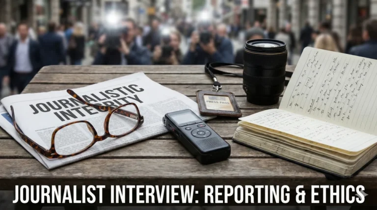
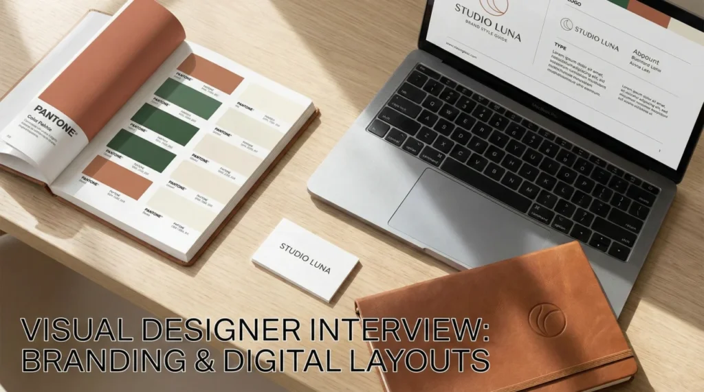
Visual designer interview questions target a specific niche in the creative world: the intersection of branding and user interface. Unlike a graphic designer who might focus on print, or a UI designer who focuses on product mechanics, a Visual Designer is responsible for the “look and feel” of a brand across all digital touchpoints. Hiring managers are looking for candidates who can take a logo and expand it into a comprehensive visual language that works on a billboard, a website header, and an Instagram story.
The role requires a deep understanding of “Design Systems” and “Conversion Rate Optimization (CRO).” It’s not enough to make things look good; they must perform. Interviewers will ask: How do you maintain visual consistency when scaling a brand? Can you explain why you chose that specific shade of blue for a call-to-action button? How do you design assets that are flexible enough for both dark mode and light mode? Your answers must prove that you are a strategic storyteller who uses pixels to drive business goals.
This comprehensive guide helps you refine your pitch. We explore the critical components of a style guide, the psychology of color in marketing, and the soft skills needed to sell your vision to non-creative stakeholders. Whether you are applying to an ad agency or an in-house marketing team, these strategies will help you visualize your success.
Role Definition & Philosophy
Q: How do you define the difference between a Visual Designer and a UI Designer?
I view UI Design as the “skeleton and muscles” – it focuses on functionality, layout structures, and interface elements. Visual Design is the “skin and soul.” It focuses on brand personality, typography, color theory, and emotional connection.
While there is overlap, my role as a Visual Designer is broader than just the product interface. I handle the marketing website, email campaigns, and social assets to ensure the brand voice is consistent before the user even enters the product app. I bridge the gap between marketing and product.
Q: What is your approach to “Visual Hierarchy”?
Visual Hierarchy is how I guide the user’s eye. I use scale, color, and whitespace to signal importance. The most important element (like a headline or “Buy Now” button) should be the most dominant.
I use the “Squint Test” – if I squint at the design, the most important elements should still be distinguishable blobs. If everything is shouting for attention, nothing is heard. I create a path for the eye to follow, reducing cognitive load.
Q: How do you incorporate “Brand Guidelines” without stifling creativity?
I treat Brand Guidelines as a playground fence, not a prison cell. They define the safe boundaries (logo usage, core colors), but inside those boundaries, there is infinite room for play.
I look for “expansion packs.” If the guidelines are too rigid, I explore secondary color palettes or new illustration styles that complement the core brand. I believe consistency builds trust, but evolution keeps a brand alive. I aim to refresh the visual language periodically while keeping the core DNA intact.
Q: Explain the “Gestalt Principles” in your work.
I use Gestalt principles like Proximity (grouping related items), Similarity (making links look alike), and Closure (using negative space). For example, in a pricing table, I use Proximity to group the price and the “Sign Up” button so they are perceived as one unit.
These psychological rules help me create layouts that feel intuitive “by magic,” but really it is just how the human brain processes visual information. It makes the design feel organized and professional.
Branding & Identity Scenarios
A client wants to change their brand color to neon green because “it pops.”
I pause and ask about the “Why” and the “Who.” Neon green pops, but does it align with their brand values (e.g., Trust, Security for a bank)? Does it pass accessibility standards for text?
I show them a mockup of the neon green in context. Often, seeing it applied to a full page reveals the eye strain. I might suggest using it as a tertiary accent color for hover states rather than a primary brand color, satisfying their urge for “pop” without compromising usability.
You are designing for a brand that has very few visual assets.
I see this as an opportunity to build the library. I focus on typography and color blocks to create visual interest without needing photos. I might create custom iconography or abstract patterns using the logo shape.
I lean into “Typographic Layouts” where the text itself becomes the image. I also advocate for a small budget to buy high-quality stock photography and treat it with a consistent filter or duotone effect to make it look proprietary.
How do you ensure consistency across a team of 5 designers?
I build a “UI Kit” or “Pattern Library” in Figma. It contains master components for buttons, headers, and form fields. Everyone pulls from this library, so we aren’t redesigning the wheel.
I also establish a weekly “Design QA” or critique session where we review each other’s work specifically for brand alignment. We catch inconsistencies (like slightly different border radiuses) before they go to development. Documentation is key.
Digital Layouts & Marketing
Q: What makes a high-converting Landing Page?
Clarity and Focus. I remove navigation links that distract from the main goal. I place the Value Proposition and primary CTA “above the fold.”
I use directional cues (arrows, gaze of people in photos) to point toward the form. I ensure the visual hierarchy leads the user down the funnel. A pretty page that doesn’t convert is just art, not design.
Q: How do you design for “Dark Mode”?
I don’t just invert the colors. True black (#000000) can cause smearing on OLED screens, so I use dark grey (#121212) surfaces. I desaturate colors because bright colors vibrate against dark backgrounds.
I use elevation (lighter greys) to show depth instead of shadows. I check that all transparent PNG logos are legible on dark backgrounds or create specific “Dark Mode” assets.
Q: How do you approach designing Display Ads (banners)?
I follow the “3-Second Rule.” The message must be instant. I keep text minimal (headline + CTA). I use strong, contrasting colors.
I animate them if possible (HTML5) but keep the final frame static with the key info. I design the smallest size (320×50 mobile) first because if it works there, it will work on the leaderboard. Consistency across sizes is vital for brand recall.
Q: What is your process for designing Email Newsletters?
I design for the “Preview Pane.” The top 300px must hook the reader. I use live text over images whenever possible for accessibility and load times.
I keep the layout single-column for mobile readability. I use clear, bulletproof buttons (coded tables, not images) so they render even if images are blocked. I test rendering across clients (Outlook, Gmail) because email HTML is notoriously finicky.
Q: How do you handle “Responsive Typography”?
I use a modular scale. I define type sizes for mobile, tablet, and desktop. A 60px headline on desktop might need to be 32px on mobile to avoid breaking words.
I use relative units (rems/ems) where possible. I check line lengths (measure) to ensure lines aren’t too long on wide screens (60-75 characters is ideal). Reading comfort is my priority across all devices.
Q: Explain “A/B Testing” from a designer’s perspective.
A/B testing removes the ego from design. It allows us to test two variations (e.g., a green button vs. a red button) to see which performs better.
I design the variants to be distinct enough to yield meaningful data. I don’t take it personally if the “uglier” version wins; I analyze why (maybe the contrast was higher) and apply that learning to the next iteration. Data makes design stronger.
Tools & Technical Execution
Q: Why do you prefer Figma over Adobe XD or Sketch?
Figma is built for the browser and collaboration. It allows developers to inspect code, copywriters to edit text, and stakeholders to comment in real-time.
Its “Auto Layout” feature simulates CSS Flexbox, which forces me to design realistically responsive components. The component library and variants feature make managing a large design system efficient. It streamlines the entire product lifecycle.
Q: How do you organize your layers and files?
I am meticulous. I name every layer (no “Frame 342”). I group related elements logically (Header, Hero, Footer). I use “Pages” in Figma to separate “Work in Progress” from “Ready for Dev.”
I create a “Cover Page” for each file with the project status and owner. Good hygiene means a developer can open my file at 2 AM and know exactly what to export without calling me.
Q: Do you use AI tools (Midjourney/Firefly) in your workflow?
Yes, for ideation and storyboarding. I use them to generate mood board imagery or quick concepts to show a client a “vibe” before committing to a photoshoot.
I also use Generative Fill in Photoshop to extend backgrounds or clean up images. I view AI as a powerful assistant that speeds up the mundane tasks, allowing me to focus on the strategic creative direction.
Q: Why do you want to be a Visual Designer?
I love the power of visual language. I am fascinated by how a simple change in color or spacing can completely alter how a user feels about a product. I enjoy the challenge of organizing chaos into clarity. I want to build brands that people love to interact with, creating digital experiences that are not just functional, but delightful.
Visual Design Competency Quiz
Take the 20-Question Challenge
1. “Visual Hierarchy” is achieved through:
- Making everything big
- Scale, Color, Contrast, and Spacing
- Using many fonts
- Removing images
2. A “Style Guide” ensures:
- The designer gets paid
- Brand consistency across different platforms and teams
- The website loads fast
- The code is clean
3. “Kerning” refers to:
- Line height
- Spacing between two specific characters
- Spacing between all letters
- Font weight
4. “RGB” is used for:
- Print design
- Digital screens (Red, Green, Blue)
- Painting
- Fabric dye
5. “The Fold” in web design is:
- A coding error
- The bottom edge of the screen visible without scrolling
- The footer menu
- A pop-up window
6. “White Space” helps to:
- Fill empty gaps
- Reduce cognitive load and focus attention
- Make the design look unfinished
- Save pixels
7. A “Hero Image” is:
- A picture of a superhero
- The large, primary visual at the top of a webpage
- The logo
- A background pattern
8. “Lorem Ipsum” is:
- Final copy
- Placeholder text used to demonstrate layout
- A Latin prayer
- A font name
9. “Typography Hierarchy” uses:
- Only one font size
- H1, H2, H3 tags (headings) to structure content importance
- Random bolding
- Colored text only
10. A “Favicon” appears in:
- The footer
- The browser tab
- The hero section
- The email signature
11. “Contrast Ratio” is important for:
- Printing costs
- Accessibility (readability for visually impaired users)
- Monitor brightness
- File size
12. “Grid Systems” provide:
- Chaotic layouts
- Structure, alignment, and consistency
- Color palettes
- Code validation
13. “Vector” graphics (SVG) are scalable because:
- They use pixels
- They use mathematical formulas (paths)
- They are small files
- They are photos
14. “CTA” stands for:
- Click To Access
- Call To Action (e.g., “Buy Now”)
- Center Text Align
- Color Tint Area
15. “Rule of Thirds” is a composition guide that:
- Splits the image into 3 colors
- Places focal points at the intersections of a 3×3 grid
- Uses 3 fonts
- Repeats elements 3 times
16. “Leading” (pronounced ledding) controls:
- Letter spacing
- Vertical space between lines of text
- Paragraph indentation
- Font width
17. A “Mood Board” is used to:
- Test user flow
- Establish the visual direction and “vibe” before designing
- Present final work
- Organize files
18. “Responsive Design” adapts to:
- User behavior
- Different screen sizes (Mobile, Tablet, Desktop)
- Server speed
- Time zones
19. “Opacity” refers to:
- Color saturation
- Transparency (0% to 100%)
- Blurriness
- Sharpness
20. “Hex Code” is:
- A password
- A 6-digit code representing a specific color (e.g., #FFFFFF)
- A font file
- A grid measurement
❓ FAQ
📜 Do I need to code?
No, but knowing the basics (HTML/CSS) makes you a better designer. It helps you understand what is possible and communicate effectively with developers. You don’t need to write production code, but you should know how the box model works.
🎨 Portfolio: Quality or Quantity?
Quality. 3-5 strong, detailed case studies are better than 20 pretty images. Show your process: the sketch, the wireframe, the struggle, and the solution. Hiring managers hire your brain, not just your hands.
💻 Mac or PC?
The design industry is 90% Mac. While tools like Figma work in the browser, most agencies and tech teams issue MacBooks. Being comfortable with macOS shortcuts is expected.
🖌️ Should I specialize?
Start as a “T-Shaped” designer. Have broad knowledge of everything (Generalist) but go deep in one area (Specialist, e.g., Typography or Motion). This makes you versatile but also the “go-to” person for something specific.
🤝 How do I handle design tests?
Treat them as a glimpse into your process. Don’t spend 20 hours on a “2-hour” test. Focus on the concept and the “why.” If they ask for free spec work (a real project they might use), be wary. Legitimate tests are usually hypothetical.
Final Thoughts
To secure a position, your answers to visual designer interview questions must show that you are a systematic thinker. Companies need designers who can create scalable visual languages, not just one-off graphics. By highlighting your knowledge of design systems, your attention to detail in layout, and your ability to collaborate with non-designers, you prove that you are the visionary they need.
⚠️ Disclaimer: The interview strategies, sample answers, and negotiation tips provided in this guide are for educational purposes only. Hiring decisions are subjective and vary by company and industry. While these strategies are based on professional HR standards, they do not guarantee a specific job offer or result.