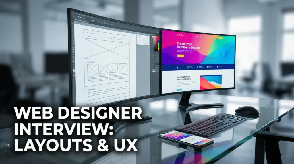
Designing the Digital Storefront
Web designer interview questions are unique because they test a hybrid skill set: artistic flair and technical constraint. Unlike a graphic designer who works on a fixed canvas, a web designer must create living, breathing interfaces that adapt to thousands of screen sizes. Hiring managers are looking for candidates who understand that “design” on the web isn’t just about how it looks, but how it works. They need professionals who can bridge the gap between a static mockup in Figma and a functional product in the browser.
The industry focus is on “Design Systems” and “Accessibility.” It is no longer acceptable to design just for the desktop; you must design for the thumb zone on a phone and the screen reader for the visually impaired. Interviewers will ask: How do you handle the handoff to developers? Do you design Mobile-First? Can you explain the difference between a wireframe and a high-fidelity prototype? Your answers must prove that you are not just making pretty pictures, but solving user problems with scalable solutions.
This comprehensive guide helps you code your career success (metaphorically speaking). We explore the critical importance of responsive layouts, the rules of web typography, and the soft skills required to defend your design choices against stakeholder feedback. Whether you are applying to a tech startup or a digital agency, these strategies will help you navigate the grid and land the job.
Design Process & Philosophy
Q: Describe your design process for a new website project.
I follow a user-centered approach. I start with Research to understand the user goals and business requirements. Then I move to Information Architecture (sitemap) to organize the content logic.
I create low-fidelity Wireframes to test the layout without getting distracted by color. Once the structure is approved, I move to high-fidelity Visual Design (UI) in Figma. Finally, I create a Prototype for testing and prepare the assets for developer handoff. This structured approach ensures we don’t waste time polishing pixels on a broken concept.
Q: What is “Mobile-First” design and why is it important?
Mobile-First is a strategy where you design the smallest screen experience before the desktop version. It forces you to prioritize the most essential content because you have limited real estate.
It is important because more web traffic comes from mobile devices than desktops. If you design for desktop first and try to cram it down to mobile later (“Graceful Degradation”), the UX usually suffers. Designing mobile-first (“Progressive Enhancement”) ensures the core experience is solid for everyone.
Q: How do you approach Accessibility (a11y) in your designs?
I treat accessibility as a constraint that fuels creativity, not a burden. I check color contrast ratios to meet WCAG AA standards (4.5:1 for text).
I design clear focus states for keyboard navigation. I use proper heading hierarchy (H1, H2, H3) for screen readers. I also ensure touch targets (buttons) are at least 44×44 pixels for fingers. Inclusive design is good design; it helps everyone, not just those with disabilities.
Q: Do you code? (HTML/CSS)
(If yes): Yes, I have a working knowledge of HTML and CSS. I can inspect elements to troubleshoot and I understand the “Box Model.” This helps me design layouts that are actually buildable.
(If no): I do not write production code, but I understand how the web works. I design with the grid and Flexbox principles in mind. I communicate constantly with developers to ensure my designs are feasible and don’t blow the performance budget.
Technical Design Knowledge
Q: What is “Responsive Design”?
Responsive design means the website layout adjusts fluidly to the screen size of the device. It uses fluid grids, flexible images, and CSS media queries.
It is different from “Adaptive Design,” which loads distinct layouts for specific breakpoints. Responsive design ensures a seamless experience whether the user is on an iPhone, an iPad, or a 4K monitor.
Q: Explain “The Fold” and its relevance today.
“The Fold” is the bottom of the screen visible without scrolling. Historically, all important info had to be “above the fold.”
Today, with infinite scrolling feeds, users are trained to scroll. While I still place the primary Value Proposition and Call to Action (CTA) near the top, I don’t cram everything there. I use visual cues to encourage scrolling down the page.
Q: How do you use a “Grid System” in web design?
I use a 12-column grid (like Bootstrap) as my foundation. It creates horizontal rhythm and alignment. It allows me to make consistent decisions: “This card spans 4 columns on desktop, but 12 columns on mobile.”
Using a grid makes the developer’s life much easier because they can map my visual layout directly to their CSS framework.
Q: What is a “Design System”?
A Design System is a single source of truth. It is a library of reusable components (buttons, inputs, nav bars) and guidelines (colors, typography rules).
It ensures consistency across the product. Instead of redesigning a “Submit” button every time, I pull the standard component. This speeds up the design process and ensures the engineering team builds with pre-approved blocks.
Q: How do you optimize images for the web?
Performance is key. I export images at the exact size needed (1x, 2x for Retina). I use modern formats like WebP or SVG for icons.
I compress images using tools like TinyPNG to reduce file size without losing visual quality. A beautiful site that takes 10 seconds to load is a failed design because users will bounce.
Q: Explain “Micro-interactions.”
Micro-interactions are subtle animations that provide feedback. Examples include a button changing color on hover, a “like” heart popping, or a loading spinner.
They make the interface feel alive and intuitive. They guide the user (e.g., shaking a password field when input is wrong). I design these states in my prototypes to show developers exactly how the UI should behave.
Collaboration & Handoff
A developer says your design is “too hard to build.” What do you do?
I listen to their constraint. Is it impossible, or just time-consuming? I ask, “What specific part is the blocker?”
I am willing to compromise. If a complex animation adds 2 weeks to the dev cycle but only minimal value to the user, I simplify it. However, if it is critical for the user experience, I work with them to find a technical solution or a library that might help achieve the vision.
A stakeholder asks you to copy a competitor’s website.
I push back professionally. “I understand you like their look, but copying them makes us a follower, not a leader. Also, their design solves their problems, not ours.”
I ask what elements they like (e.g., the clean navigation or the color scheme) and incorporate those principles into a unique design that fits our brand identity. I frame it as differentiating ourselves in the market.
How do you prepare your design files for handoff?
I clean up my Figma file. I remove unused layers and draft artboards. I name my layers clearly (e.g., “Btn_Primary_Hover” not “Rectangle 43”).
I ensure all assets are exportable. I write annotation notes for specific behaviors (e.g., “This header sticks on scroll”). I walk the developer through the file in a meeting to answer questions upfront. A clean handoff prevents the “pixel perfect” wars later.
Tools & Typography
Q: Why do you use Figma (or Sketch/Adobe XD)?
I prefer Figma because it is browser-based and collaborative. It allows real-time co-editing with other designers and easy sharing with stakeholders (no “Version 2_Final_Final” files).
Its Auto-Layout feature is a game-changer because it mimics how CSS Flexbox works, forcing me to design responsively rather than statically. The community plugins also speed up my workflow significantly.
Q: What are the rules for Web Typography?
Legibility is #1. I use sans-serif fonts for body text on screens usually. I stick to a limited scale (e.g., 16px base, 1.5 line height).
I avoid using too many different typefaces (maximum 2 or 3). I ensure high contrast between text and background. I use web-safe fonts or serve fonts via Google Fonts/Adobe Fonts to ensure they load quickly and look consistent across browsers.
Q: What is “Wireframing”?
Wireframing is the blueprint phase. It focuses on layout, spacing, and content placement without styling. I use it to get sign-off on where things go before we decide what color they are.
It saves time. Changing a wireframe takes 5 minutes; moving a high-fidelity pixel-perfect layout takes an hour. It forces the client to focus on structure and flow first.
Q: Why do you want to be a Web Designer?
I love the immediacy of the web. Unlike print, which is permanent, the web is iterative. I enjoy the challenge of designing something that is both beautiful and functional, something that people use, not just look at. I get satisfaction from solving the puzzle of how to make complex information simple and accessible on a 5-inch screen.
Web Design Competency Quiz
Take the 20-Question Challenge
1. “Responsive Design” responds to:
- The user’s mood
- The viewport size (screen width) of the device
- The internet speed
- The time of day
2. “Above the Fold” refers to:
- Origami
- Content visible on the screen without scrolling
- The footer
- Hidden menus
3. “Hamburger Menu” is typically used on:
- Restaurant websites only
- Mobile interfaces to hide navigation links
- Desktop footers
- Print flyers
4. A “Favicon” is:
- A favorite icon
- The small icon displayed in the browser tab next to the title
- A large hero image
- A social media link
5. “CSS” stands for:
- Creative Style Sheets
- Cascading Style Sheets
- Computer Screen Standard
- Coding Simple Syntax
6. A “Hero Section” is:
- A page about superheroes
- The large, prominent visual area at the top of a webpage
- The contact form
- The about us page
7. “Whitespace” (Negative Space) is used to:
- Fill empty gaps with ads
- Provide breathing room and separate elements for clarity
- Make the site load faster
- Save battery life
8. “Alt Text” is crucial for:
- Making the font alternative
- Accessibility (screen readers) and SEO
- Changing colors on hover
- Hiding images
9. A “Prototype” differs from a Mockup because:
- It is black and white
- It is interactive and simulates user flow/clicks
- It is for print
- It has no text
10. “Kerning” adjusts the space between:
- Lines of text
- Two specific characters
- Words
- Paragraphs
11. “SVG” format is best for:
- Photographs
- Logos and icons (scalable vector graphics)
- Videos
- Music
12. “Hover State” indicates:
- The site is broken
- The visual change when a mouse cursor is placed over an element
- Touch screen interaction
- Loading time
13. The standard resolution for screen design is:
- 300 DPI
- 72 PPI (pixels per inch)
- 1000 PPI
- 10 DPI
14. “CTA” stands for:
- Click To Access
- Call To Action (e.g., “Sign Up Now”)
- Color Text Area
- Center Text Alignment
15. “F-Pattern” describes:
- A coding error
- How users typically scan text-heavy websites (Top, then down the left)
- A layout grid
- A font style
16. “Breadcrumbs” help users:
- Eat snacks
- Navigate back to previous categories/pages (e.g., Home > Men > Shoes)
- Find the search bar
- Delete history
17. A “Modal” (or Lightbox) is:
- A type of font
- A window that pops up over the main content, disabling the background
- A dark mode switch
- A footer link
18. “Parallax Scrolling” creates depth by:
- Using 3D glasses
- Moving background images slower than foreground content during scroll
- Stopping the scroll
- Flashing colors
19. “Graceful Degradation” means:
- The site breaks on old browsers
- Designing for modern browsers but ensuring basic functionality on older ones
- Designing for mobile first
- Removing images
20. “Hex Code” represents:
- A spell
- A specific color using a 6-digit alphanumeric code (e.g., #FFFFFF)
- The font size
- The screen width
❓ FAQ
📜 Do I need a portfolio?
Absolutely. Your portfolio is your resume. It should be an online website (not a PDF) that is responsive itself. Showcase 4-6 strong case studies that explain your process, not just the final UI.
💻 Do I need to know JavaScript?
No, but it’s a “Nice to Have.” Knowing HTML/CSS is expected for a web designer to understand feasibility. JS is typically the domain of the Frontend Developer, but understanding basic interactions helps.
🎨 Should I use a template for my portfolio?
It’s risky. If you are a Web Designer, your portfolio site is the first test of your skills. Building it yourself (or heavily customizing a Webflow/Wordpress theme) shows competence. Using a generic template might suggest you can’t design for the web.
📱 How do I show mobile designs in my portfolio?
Show them side-by-side with desktop mockups. Use device mockups (placing your design inside a phone frame) to give context. Ensure your case study discusses how you adapted the layout for small screens.
🤝 What if I don’t have real client work?
Do “Concept Projects.” Redesign a popular app or a local non-profit’s site. Clearly label it as a concept. Hiring managers care about your thinking and visual skills, not just who paid you.
Final Thoughts
To secure a position, your answers to web designer interview questions must demonstrate that you are a user advocate who speaks the language of developers. Companies need designers who can create systems, not just pages. By highlighting your knowledge of responsive grids, accessibility standards, and your collaborative workflow, you prove that you are the architect they need to build their digital future.
⚠️ Disclaimer: The interview strategies, sample answers, and negotiation tips provided in this guide are for educational purposes only. Hiring decisions are subjective and vary by company and industry. While these strategies are based on professional HR standards, they do not guarantee a specific job offer or result.