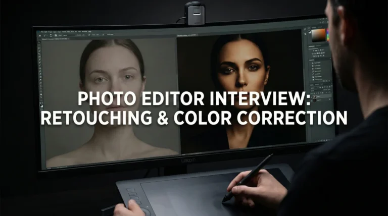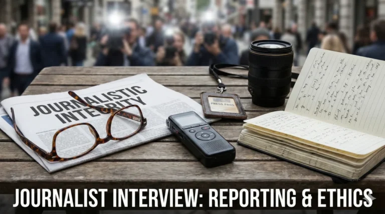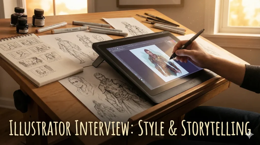
More Than Just Drawing Pretty Pictures
Illustrator interview questions are designed to peel back the layers of your portfolio to reveal the thinking behind the ink. An illustrator is not just a decorator; they are a visual translator. Whether creating editorial art for the New York Times, character concepts for a video game, or packaging design for a coffee brand, the job is to take a complex idea and distill it into a single, compelling image. Hiring managers are looking for candidates who can marry artistic flair with commercial viability.
The industry is grappling with the rise of AI Art. Interviewers will ask: How do you maintain a unique “voice” in a saturated market? Can you adapt your style to fit a brand’s guidelines without losing your soul? How do you handle the pressure of a 24-hour turnaround for a news illustration? Your answers must prove that you are a disciplined professional who treats creativity as a job, not just a hobby.
This comprehensive guide helps you sketch out your success. We explore the critical importance of visual storytelling, the technical debate between vector and raster, and the soft skills required to interpret a vague client brief. Whether you are a freelance artist or seeking an in-house role, these strategies will help you draw the perfect conclusion: that you are the right hire.
Creative Process & Storytelling
Q: Walk me through your process from a blank page to final illustration.
I start with “Thumbnails” – tiny, rough sketches to test composition and value (light/dark) without getting bogged down in details. I usually generate 10-15 thumbnails to exhaust the clichés first.
Once a concept is selected, I create a “Refined Sketch” or line drawing for client approval. This locks in the anatomy and perspective. Then I move to “Color Blocking” to establish the mood. Finally, I add texture and lighting details (Rendering). This structured approach minimizes major revisions in the final stage.
Q: How do you approach “Visual Storytelling”?
I focus on the “Narrative Arc” within a single frame. I ask: What happened right before this moment, and what will happen right after? This adds tension and movement.
I use composition to guide the eye. For example, leading lines pointing to the main character, or using color contrast to highlight the emotional focal point. I also use symbolism – a wilting flower to suggest sadness, or a storm cloud to suggest conflict – to add layers of meaning beyond the literal.
Q: How do you develop and maintain a consistent personal style?
I view style as a combination of three things: Subject Matter, Medium, and “Handwriting” (line quality). My style is defined by [mention specific traits, e.g., bold outlines and limited color palettes].
To maintain consistency, I use a specific set of custom brushes and color libraries. However, I am flexible. If a project requires a softer, watercolor look, I can adapt my tools while keeping my core sense of composition intact. Consistency builds a brand, but adaptability pays the bills.
Q: How do you handle a brief that is incredibly vague (e.g., “Draw something cool”)?
I treat a vague brief as an interview. I ask probing questions: “What is the emotion we want the viewer to feel? Who is the target audience? Can you show me 3 examples of ‘cool’ art that you like?”
I create a “Mood Board” before I start sketching to align our visual vocabularies. “Cool” means different things to a skater brand vs. a luxury bank. I don’t start drawing until we agree on the direction.
Style, Technique & Mediums
Q: What is the difference between Vector and Raster illustration?
Vector (Adobe Illustrator) uses mathematical paths. It is infinitely scalable without quality loss, making it ideal for logos, icons, and large-format print.
Raster (Photoshop/Procreate) uses pixels. It allows for rich texture, blending, and painterly effects but cannot be scaled up indefinitely. I choose the medium based on the final output.
Q: How do you use “Reference Images” without copying?
I use references for anatomy, lighting, or specific object details (like how a bicycle chain works). I never trace a single image.
I practice “Frankensteining” – combining a pose from one photo, lighting from another, and clothing from a third. This creates a unique image that is anatomically correct but original. Relying on memory often leads to wonky perspective.
Q: Explain your use of color theory in illustration.
I use color to tell the story emotionally. I might use a “Complementary” scheme (Orange/Blue) for high energy and contrast, or “Analogous” (Blue/Green) for harmony and calm.
I also use “Atmospheric Perspective” – fading colors in the background to create depth. I limit my palette to 3-5 main colors to keep the image cohesive and prevent visual chaos.
Q: How do you handle “Character Design”?
I start with the “Silhouette Test.” If you black out the character, is it still recognizable? A strong silhouette conveys personality (spiky = villain, round = friendly).
I also think about function. If the character is a runner, they need appropriate shoes and build. I create a “Turnaround” sheet showing the character from front, side, and back to ensure consistency for animation or comics.
Q: What is your experience with “Editorial Illustration”?
Editorial work is about conceptual speed. I have to read an article and find a visual metaphor that summarizes the point without just repeating the headline.
Instead of drawing a businessman shaking hands (literal), I might draw two puzzle pieces locking together (metaphorical). It requires lateral thinking and the ability to work under extremely tight deadlines (often 24 hours).
Q: How do you prepare files for print vs. web?
For Print, I work in CMYK color mode at 300 DPI (dots per inch) and include a bleed area. I check my blacks to ensure they are “Rich Black” not muddy.
For Web, I work in RGB at 72 PPI (pixels per inch) or higher for Retina displays. I export in web-optimized formats (SVG for vectors, WebP/JPG for rasters) to ensure fast load times without artifacts.
Client Management & Feedback
A client hates your sketch and wants to go in a totally different direction.
I don’t take it personally. Sketching is the “cheap” phase for exactly this reason. I ask specific questions: “What elements aren’t working? Is it the concept or the composition?”
I refer back to the brief. If the new direction is a “Scope Creep” (totally different from the contract), I politely mention that a major pivot might incur a revision fee. I view it as a collaborative puzzle solving, not a rejection of my art.
The client asks you to mimic another artist’s style exactly.
I explain the legal and ethical risks of copyright infringement. “I can’t copy their work, but I can analyze why you like it. Is it the texture? The line weight?”
I offer to create something “inspired by” that vibe but filtered through my own hand. If they insist on a direct copy, I might decline the job, as I was hired for my style, not to be a photocopier for someone else.
You are running late on a deadline due to illness or technical failure.
I communicate immediately – before the deadline passes. “I’ve hit a snag and won’t make the 5 PM delivery. I can send you a rough draft now to show progress, and the final by 9 AM tomorrow.”
Most clients appreciate the heads-up. Ghosting is unprofessional. I offer a small discount or an extra revision as a goodwill gesture if the delay impacts their schedule significantly.
Tools & Professionalism
Q: Why do you choose Procreate (or Photoshop/Illustrator) over others?
I use Procreate for the initial sketching and “painterly” feel because the iPad allows for natural hand movement. It mimics traditional media perfectly.
However, I often finish in Photoshop for color correction and complex layering, or Illustrator for typography and vectorizing. I am tool-agnostic; I use whatever software gets the job done most efficiently for that specific project requirements.
Q: How do you organize your layers?
I am disciplined with naming layers (e.g., “Inking,” “Base Color,” “Highlights,” “Background”). I group them logically.
This is crucial because clients often ask for “edits to just the hair” or “remove the background.” If I paint on one single flat layer, those edits are impossible. Non-destructive editing (using masks instead of erasing) saves me hours of reworking.
Q: How do you handle pricing and contracts?
I price based on usage (licensing), not just hourly labor. An illustration for a global ad campaign costs more than one for a local newsletter, even if they take the same time to draw.
I always use a contract that specifies the “Deliverables” (file types), “Revisions” (e.g., 2 rounds included), and “Rights” (e.g., exclusive for 1 year). This protects both me and the client from misunderstandings.
Q: Why do you want to be an Illustrator?
I love the power of visual communication. An illustration can explain a concept faster than a paragraph of text. I enjoy the challenge of solving problems visually and the variety of working on different topics. Whether it’s making a dry tech article look exciting or designing a whimsical book cover, I find joy in adding beauty and clarity to the world.
Illustration Competency Quiz
Take the 20-Question Challenge
1. A “Thumbnail” sketch is:
- A detailed drawing of a thumb
- A small, rough sketch to explore composition ideas quickly
- The final artwork
- A digital file format
2. “CMYK” is the color mode used for:
- Digital screens
- Print production (Cyan, Magenta, Yellow, Key/Black)
- Video editing
- Web animation
3. “Vector” art is defined by:
- Pixels that blur when zoomed
- Mathematical paths that scale infinitely without quality loss
- Oil paint textures
- Using a mouse only
4. “Bleed” in printing refers to:
- Ink spilling
- Artwork extending beyond the trim edge to prevent white borders
- A paper cut
- Using too much red
5. “Spot Color” (Pantone) is:
- A mistake on the paper
- A pre-mixed specific ink color used for brand consistency
- Mixing RGB colors
- A random color
6. The “Rule of Thirds” helps with:
- Pricing artwork
- Composition (placing focal points off-center)
- Choosing brushes
- Saving files
7. A “Mood Board” is used to:
- Test the client’s mood
- Establish the visual direction and “vibe” before starting final work
- Display finished art
- Organize layers
8. “Raster” images are made of:
- Vectors
- Pixels (Picture Elements)
- Lines
- Code
9. “Value” in art refers to:
- The cost of the drawing
- The lightness or darkness of a color
- The brightness
- The saturation
10. “Line Weight” variation creates:
- Heavier files
- Depth and visual interest (thick lines closer, thin lines further)
- Messy drawings
- Printing errors
11. A “Clipping Mask” allows you to:
- Cut the paper
- Hide parts of a layer so they only show inside a specific shape below it
- Delete pixels permanently
- Merge layers
12. “DPI” stands for:
- Drawings Per Inch
- Dots Per Inch (Resolution for print)
- Digital Pen Interface
- Direct Print Image
13. “Negative Space” is:
- A bad drawing
- The empty space around and between the subject(s)
- A black background
- An error message
14. “Concept Art” is primarily for:
- Museums
- Visualizing ideas for movies/games before production begins
- Selling prints
- Political cartoons
15. “Copyright” automatically protects your work:
- Only if you register it
- The moment it is created in a tangible form
- Only if you sign it
- Never
16. “Work for Hire” means:
- You own the copyright
- The employer/client owns the copyright to the work you create
- You work for free
- You are hiring someone
17. An “EPS” file is a common format for:
- Videos
- Vector graphics (Encapsulated PostScript)
- Music
- Word documents
18. “Gouache” is a type of paint that is:
- Transparent like watercolor
- Opaque watercolor, dries matte
- Oil-based
- Plastic-based (Acrylic)
19. “Storyboarding” involves:
- Writing a novel
- Sequential drawings to plan a video or animation narrative
- Boarding up a window
- Telling stories aloud
20. To prevent hand strain (RSI), you should:
- Grip the pen tighter
- Take frequent breaks and stretch wrist/arm muscles
- Draw faster
- Use a mouse only
❓ FAQ
📜 Do I need an art degree?
No. Your portfolio is 100% of the hiring decision. Art school helps with networking and critique, but a self-taught artist with a killer portfolio will get hired over a degree holder with weak work every time.
🎨 Should I specialize in one style?
It helps. Art Directors hire based on consistency. They want to know that if they hire you, the result will look like your portfolio. Being a “jack of all trades” can sometimes make you look like a master of none.
💻 What hardware do I need?
Standard is a drawing tablet (Wacom/Cintiq) or an iPad Pro with Apple Pencil. You need a computer powerful enough to handle large Photoshop files without lagging.
🤖 Will AI replace illustrators?
It will replace generic illustration. It cannot replace specific visual problem solving, consistent character design, or complex conceptual metaphors. Learn to use AI as a tool for ideation, not a replacement for your skill.
💼 Freelance or In-House?
Freelance offers freedom and variety but requires business hustle (taxes, finding clients). In-House offers stability and benefits but less creative variety. Many illustrators start In-House to learn the ropes and then go Freelance.
Final Thoughts
To secure a position, your answers to illustrator interview questions must demonstrate that you are a conceptual thinker, not just a hand for hire. Clients need illustrators who can take a boring brief and turn it into visual gold. By highlighting your structured creative process, your technical versatility, and your professional reliability, you prove that you are the artist they can trust with their brand.
⚠️ Disclaimer: The interview strategies, sample answers, and negotiation tips provided in this guide are for educational purposes only. Hiring decisions are subjective and vary by company and industry. While these strategies are based on professional HR standards, they do not guarantee a specific job offer or result.